OpenRoad + Mod7
Two pioneering organizations, together at last.
OpenRoad is pleased to announce the acquisition of creative agency Mod7.
Read the letter from our PrincipalOpenRoad + Mod7
OpenRoad is pleased to announce the acquisition of creative agency Mod7.
Read the letter from our PrincipalPosted on October 04, 2007 in Official News by Mod7
UJC's fundraising online documentary for small businesses affected by the 2006 Lebanon-Israeli War is featured in Step Inside Design's Sept/Oct 2007 Issue. We're very happy to see our work getting a positive response by our peers and the industry. This was a great project to be involved with, full of technical and content innovations (for us).
The article states, "Mod7 approached this project with restraint and an uncanny knack for storytelling," and continues on with "...the site creates an immersive environment with the depth and emotional heft of a typical PBS documentary... [Wil] Arndt's inspiration for the project came from the powerful spreads in National Geographic magazine."
 (Click to view enlarged version of magazine scans)
The full article text:
Insight | strength in storytelling
BY MICHELLE TAUTE
A FUNDRAISING SITE'S DESIGN TAKES A BACKSEAT TO POWERFUL STORIES OF SMALL-BUSINESS OWNERS.
It's the voice that grabs your attention first. "The war started in July... It was all of a sudden." These words appear on the screen one at a time-white text on a black background-as they're spoken with a calm, steady command. Within an instant, you're dropped into the middle of the story, listening intently to a man you can't yet see. A few seconds later his face stares out at you from a full-screen photograph, and you start to learn about life in Israel.
The documentary-style approach immediately shows off this website's ( www.mod7.com/portfolio/ujciec ) greatest strength: Design never overshadows the story. Instead, Vancouver-based Mod7 approached this project with restraint and an uncanny knack for storytelling. The design firm created the site for United Jewish Communities (UJC) to help the organization raise awareness about the plight of small-business owners in northern Israel. The region's entrepreneurs are still struggling to get back on their feet after a war in the summer of 2006 brought tourism to a halt.
AUTHENTIC VOICE
When UJC stepped up with substantial support after the conflict first broke out, Mod7 had to figure out how to communicate the ongoing need for donations from Jewish communities in the United States and Canada. The solution? Give small-business owners the chance to speak for themselves. UJC provided Mod7 with hours of audio interviews and thousands of still photographs. This raw material came with built-in authenticity, but still needed to be shaped into a compelling story. A junior designer transcribed the audio interviews, and the firm used this text file to identify the most salient points and begin to shape a narrative. "It was like making a script in reverse," says Wil Arndt, Mod7 creative director and principal. "I could take the Word document and pull out all the things that popped out to me."
Eventually, these audio clips became the backbone for a refreshingly simple Flash presentation: A slide show cycles visitors through a series of portrait photographs that show people in everyday environments. The images change in tandem with the audio quotes, giving users the chance to look each speaker in the eyes as compelling testimonials unfold. In fact, the still images make it easier to connect with the voices than if the design team had pushed the client to shoot actual video. Without movement and body language, the focus remains on what each person actually says, rather than how they deliver the words.
A picture of a chiropractor, for instance, flashes onto the screen as he begins speaking: "I didn't work for five weeks. I had absolutely no income coming in." His words cut straight to the point and make it easy to imagine how a similar setback would affect your own life-especially after other speakers, from an icecream shop owner to a tour guide, echo similar sentiments. Arndt believes the slide-show approach provides a more meditative environment than a video. There's a stillness that gives visitors head space to process the rich emotional quilt woven together by the speakers' powerful life experiences.
UNIVERSAL APPEAL
Overall, the site creates an immersive environment with the depth and emotional heft of a typical PBS documentary. In fact, the site design makes it possible to sit back and watch the presentation unfold as you might a TV program. If you do nothing more than type the site's address into your browser, you'll move through the entire four-chapter story seamlessly, discovering why these business owners need your help. This makes the site friendly to any web user, including older, less tech-savvy browsers who might be inclined to donate. It also helps ensure the most important messages come across, regardless of where else you click on the site.
DESIGNING FOR CONTEXT
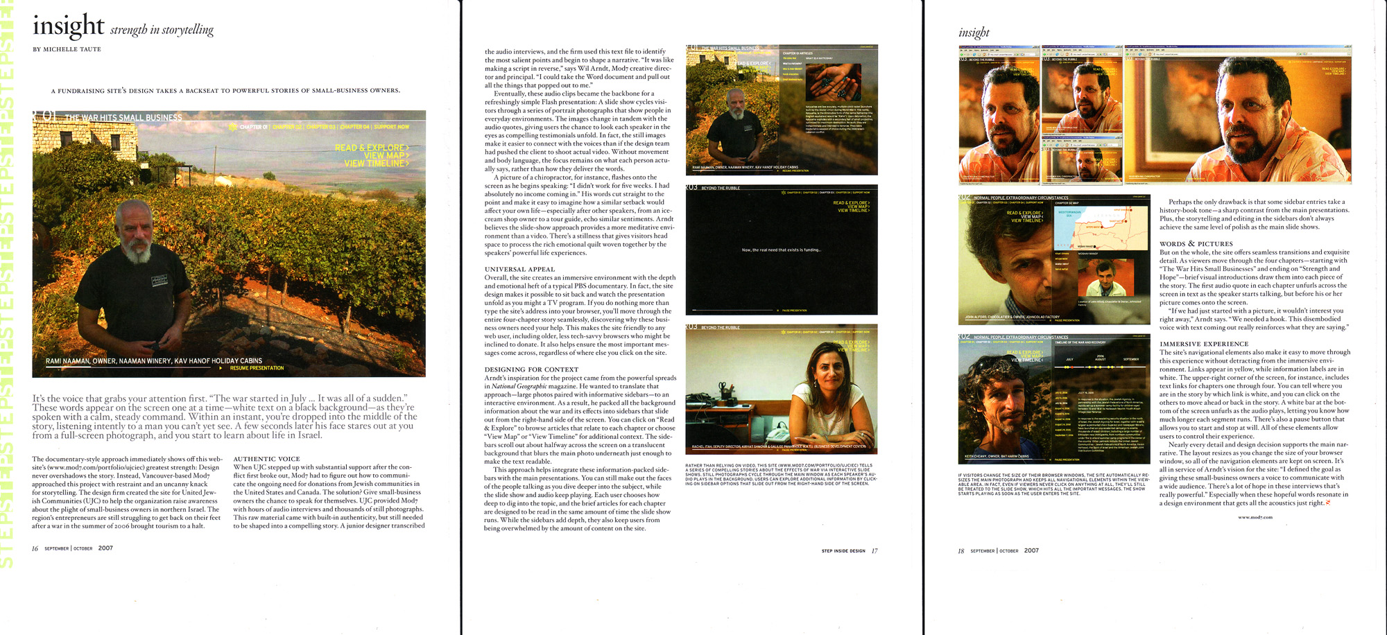
Arndt's inspiration for the project came from the powerful spreads in National Geographic magazine. He wanted to translate that approach-large photos paired with informative sidebars-to an interactive environment. As a result, he packed all the background information about the war and its effects into sidebars that slide out from the right-hand side of the screen. You can click on "Read & Explore" to browse articles that relate to each chapter or choose "View Map" or "View Timeline" for additional context. The sidebars scroll out about halfway across the screen on a translucent background that blurs the main photo underneath just enough to make the text readable.
This approach helps integrate these information-packed sidebars with the main presentations. You can still make out the faces of the people talking as you dive deeper into the subject, while the slide show and audio keep playing. Each user chooses how deep to dig into the topic, and the brief articles for each chapter are designed to be read in the same amount of time the slide show runs. While the sidebars add depth, they also keep users from being overwhelmed by the amount of content on the site.
--
RATHER THAN RELYING ON VIDEO, THIS SITE ( WWW.M0D7.COM/P0RTF0LI0/UJCIEC ) TELLS A SERIES OF COMPELLING STORIES ABOUT THE EFFECTS OF WAR VIA INTERACTIVE SLIDE SHOWS. STILL PHOTOGRAPHS CYCLE THROUGH THE MAIN WINDOW AS EACH SPEAKER'S AUDIO PLAYS IN THE BACKGROUND. USERS CAN EXPLORE ADDITIONAL INFORMATION BY CLICKING ON SIDEBAR OPTIONS THAT SLIDE OUT FROM THE RIGHT-HAND SIDE OF THE SCREEN.
--
Perhaps the only drawback is that some sidebar entries take a history-book tone-a sharp contrast from the main presentations. Plus, the storytelling and editing in the sidebars don't always achieve the same level of polish as the main slide shows.
WORDS & PICTURES
But on the whole, the site offers seamless transitions and exquisite detail. As viewers move through the four chapters-starting with "The War Hits Small Businesses" and ending on "Strength and Hope"-brief visual introductions draw them into each piece of the story. The first audio quote in each chapter unfurls across the screen in text as the speaker starts talking, but before his or her picture comes onto the screen.
"If we had just started with a picture, it wouldn't interest you right away," Arndt says. "We needed a hook. This disembodied voice with text coming out really reinforces what they are saying."
--
IF VISITORS CHANGE THE SIZE OF THEIR BROWSER WINDOWS, THE SITE AUTOMATICALLY RESIZES THE MAIN PHOTOGRAPH AND KEEPS ALL NAVIGATIONAL ELEMENTS WITHIN THE VIEWABLE AREA. IN FACT, EVEN IF VIEWERS NEVER CLICK ON ANYTHING AT ALL, THEY'LL STILL BE TREATED TO THE SLIDE SHOW, WHICH HITS ALL THE IMPORTANT MESSAGES. THE SHOW STARTS PLAYING AS SOON AS THE USER ENTERS THE SITE.
--
IMMERSIVE EXPERIENCE
The site's navigational elements also make it easy to move through this experience without detracting from the immersive environment. Links appear in yellow, while information labels are in white. The upper-right corner of the screen, for instance, includes text links for chapters one through four. You can tell where you are in the story by which link is white, and you can click on the others to move ahead or back in the story. A white bar at the bottom of the screen unfurls as the audio plays, letting you know how much longer each segment runs. There's also a pause button that allows you to start and stop at will. All of these elements allow users to control their experience.
Nearly every detail and design decision supports the main narrative. The layout resizes as you change the size of your browser window, so all of the navigation elements arc kept on screen. It's all in service of Arndt's vision tor the site: "I defined the goal as giving these small-business owners a voice to communicate with a wide audience. There's a lot of hope in these interviews that's really powerful." Especially when these hopeful words resonate in a design environment that gets all the acoustics just right.